Vaporwave Brand Design
Graphic Design - Case Study
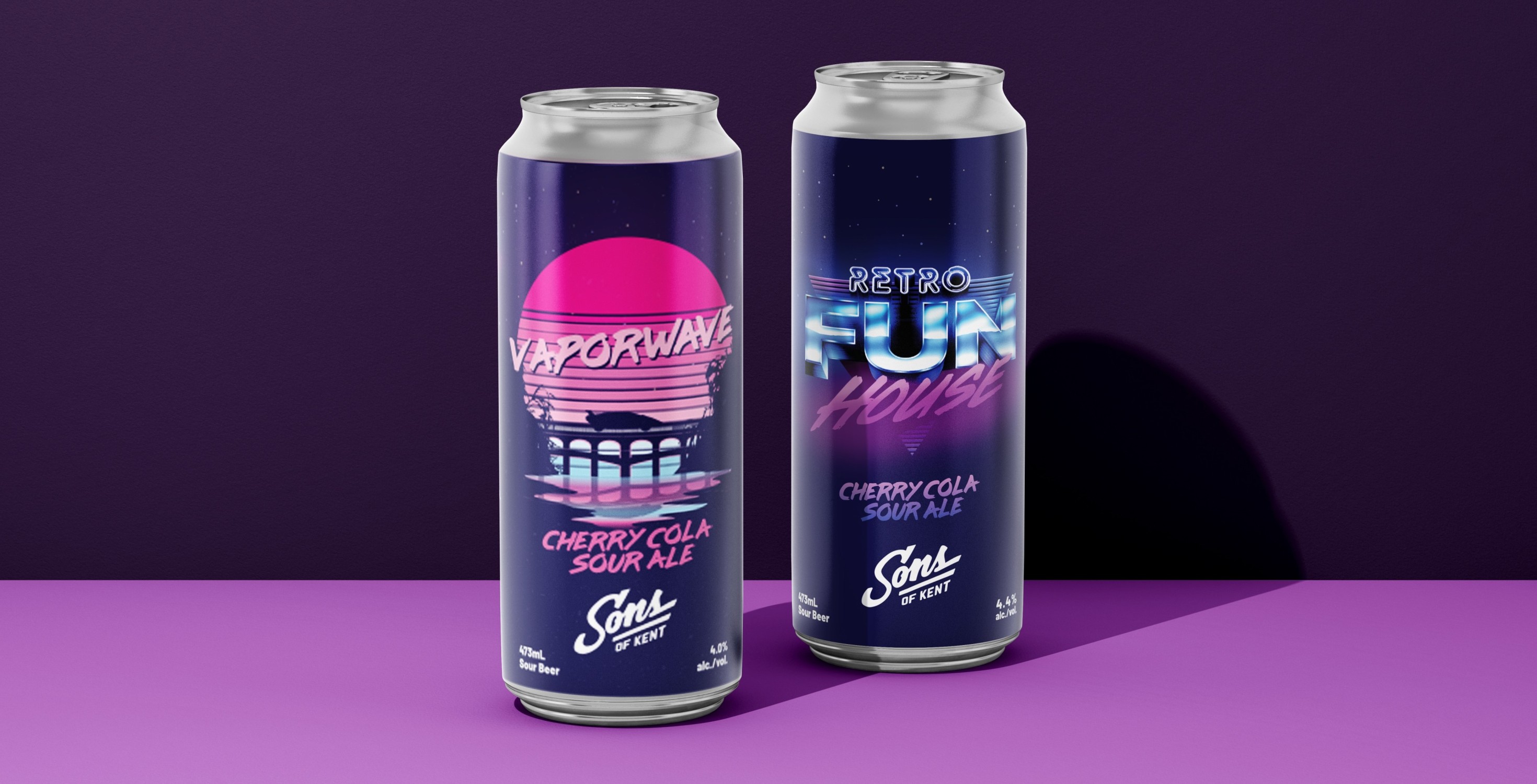
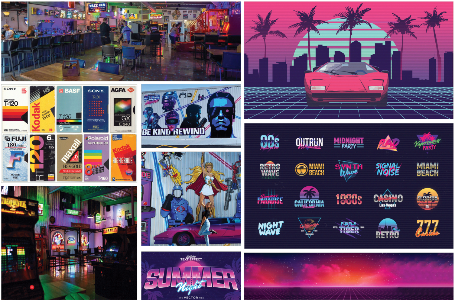
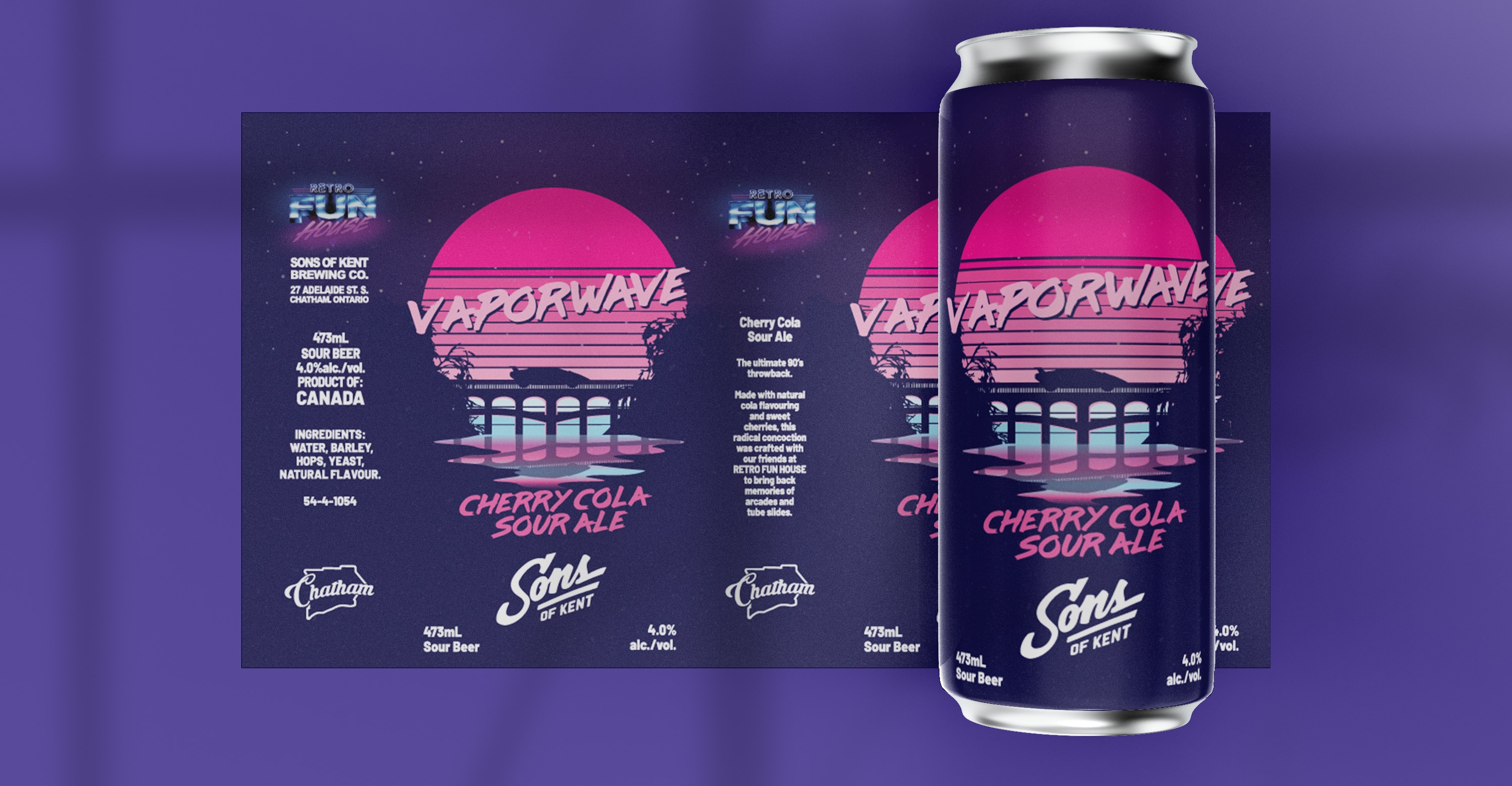
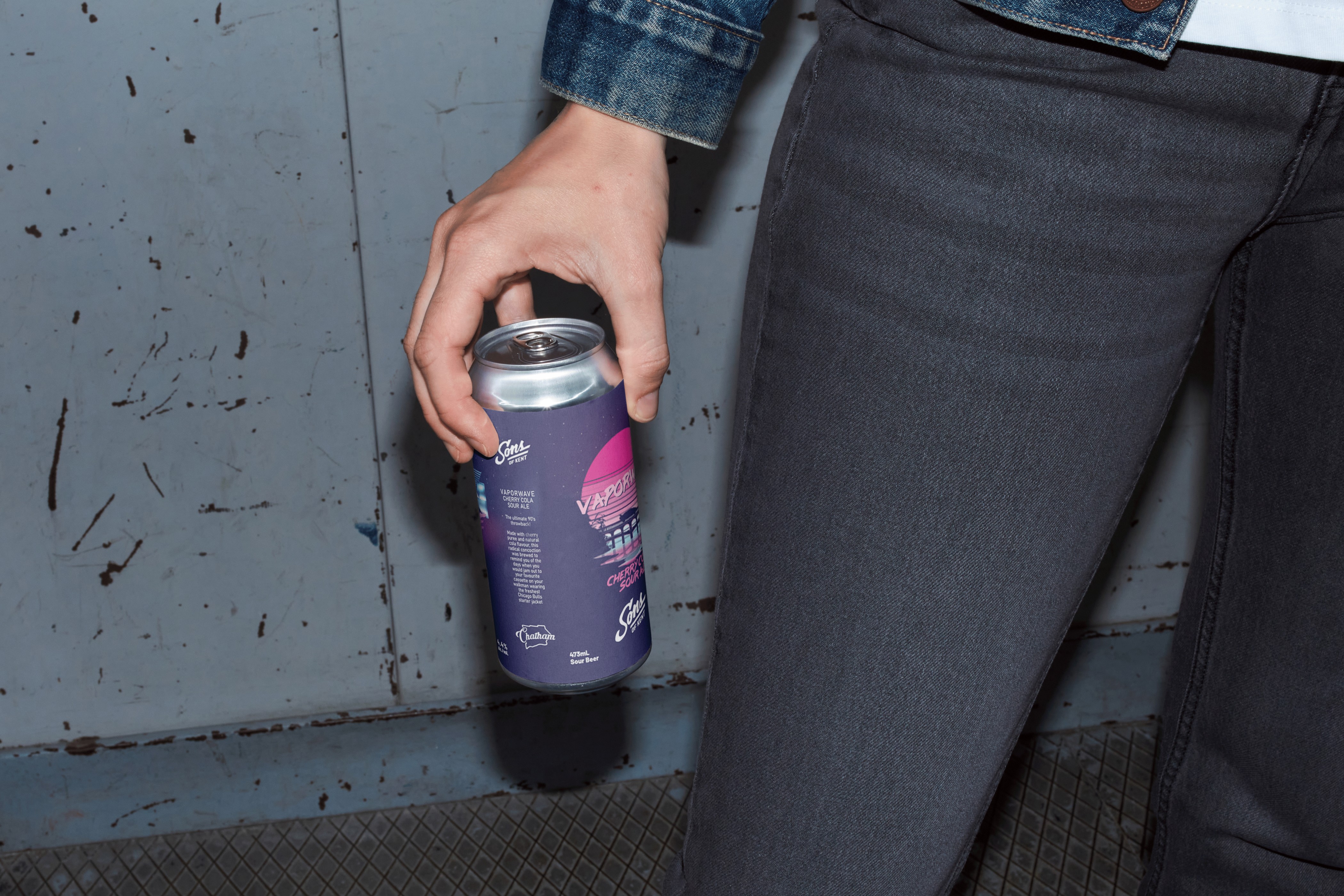
Making A Statement
With the launch of a new local hotspot reminiscent of an 80s arcade, the team and I at Sons of Kent Brewing Company met with the Arcade owners to create something to make their first summer as a business meaningful. This resulted in the creation of a drink that truly felt like the 80s.
Responsibilites
- Business Research
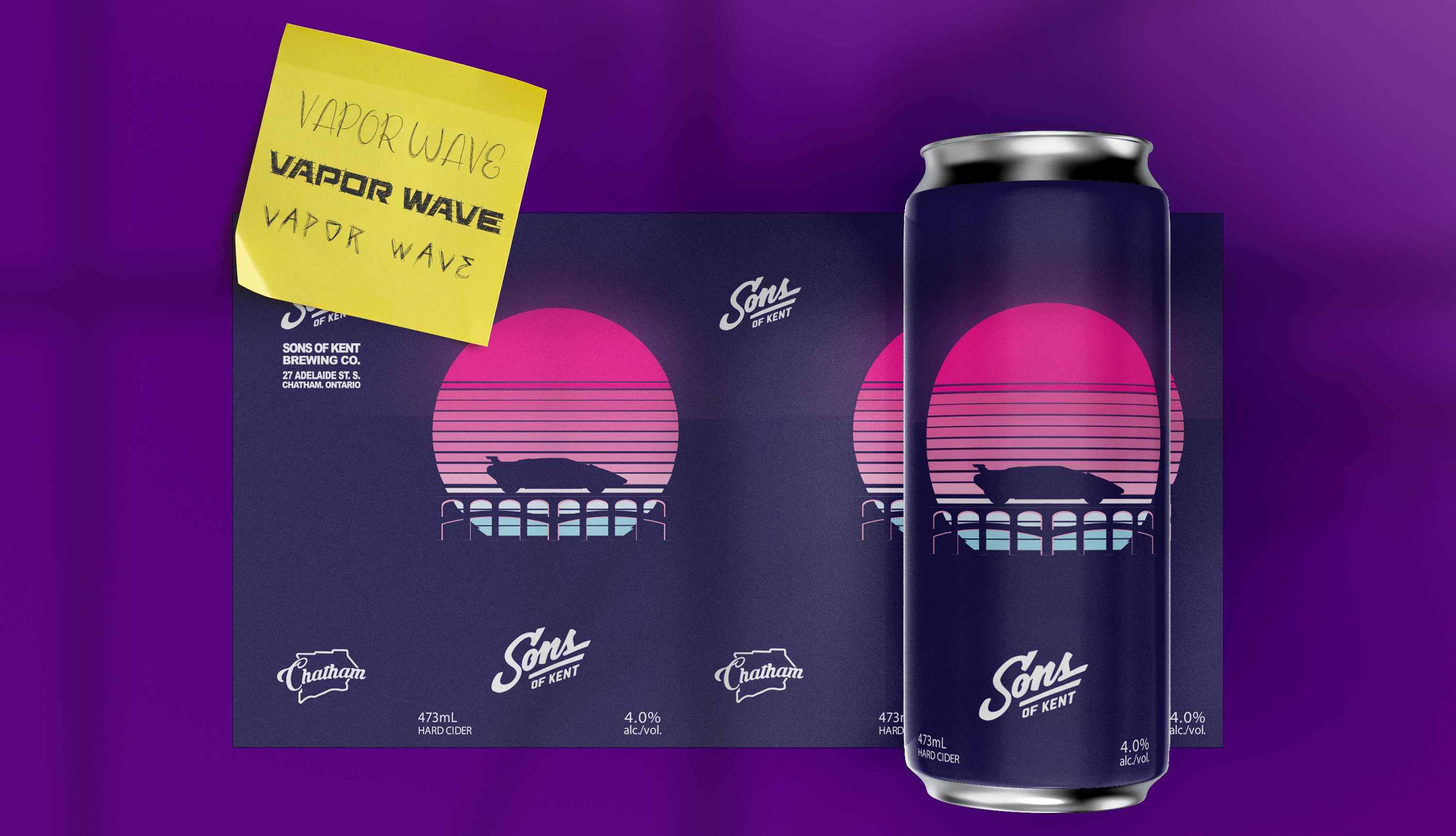
- Product Naming
- Visual Development
- Product Naming
- Visual Development
Project Duration
4 Weeks
Tools Used
Adobe Illustrator
Adobe Photoshop